
SaaS Design Challenge
Improve usability of a SaaS dashboard interface.
Company
A company using social listening AI technology to help clients track and monitor consumers’ emotions, motivation, brand perception, and marketing trends.
(June, 2021)
Process
Sa: Background Research + Defining
Su: Wireframing + Usability Test
Mo: Hi-fi Prototyping + Style Guide
Tu: Presentation Documentation
Goal
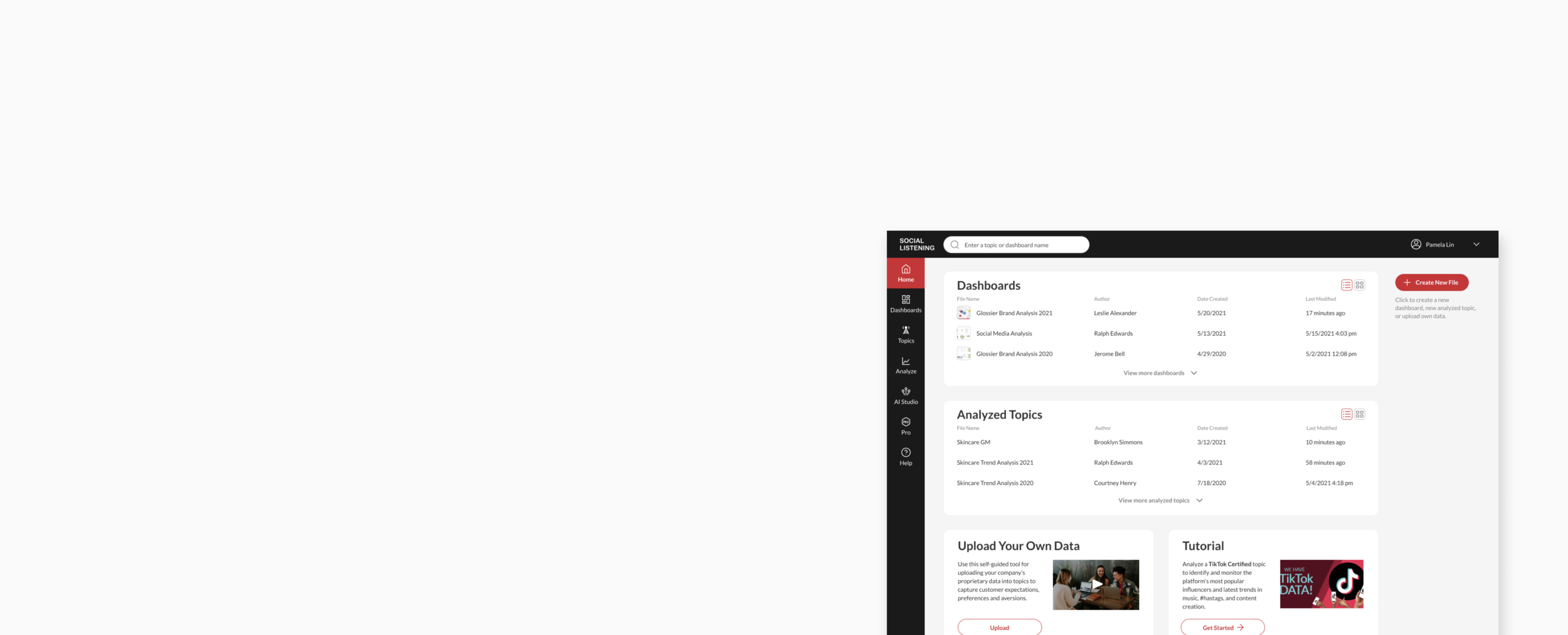
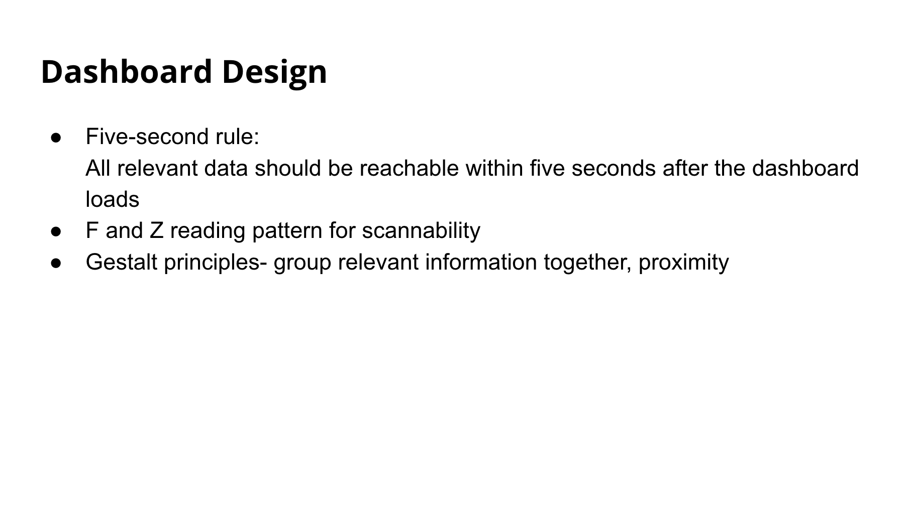
Improve the usability of dashboard home page interface so that clients can track and monitor data faster.
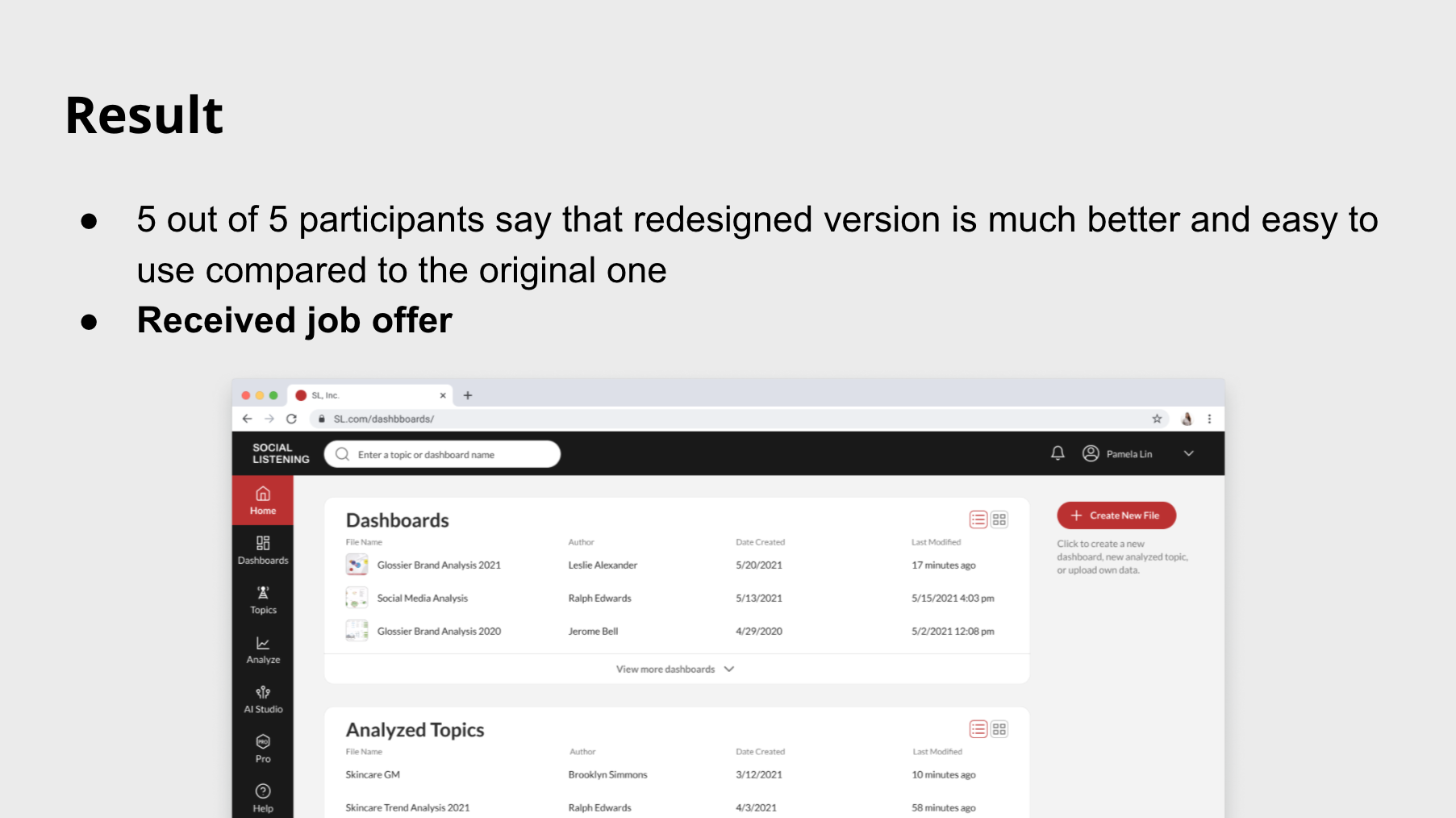
Result
Received job offer.
Design Challenge
How might we improve the usability of the dashboard homepage so that clients can monitor data faster?
User Interface Design

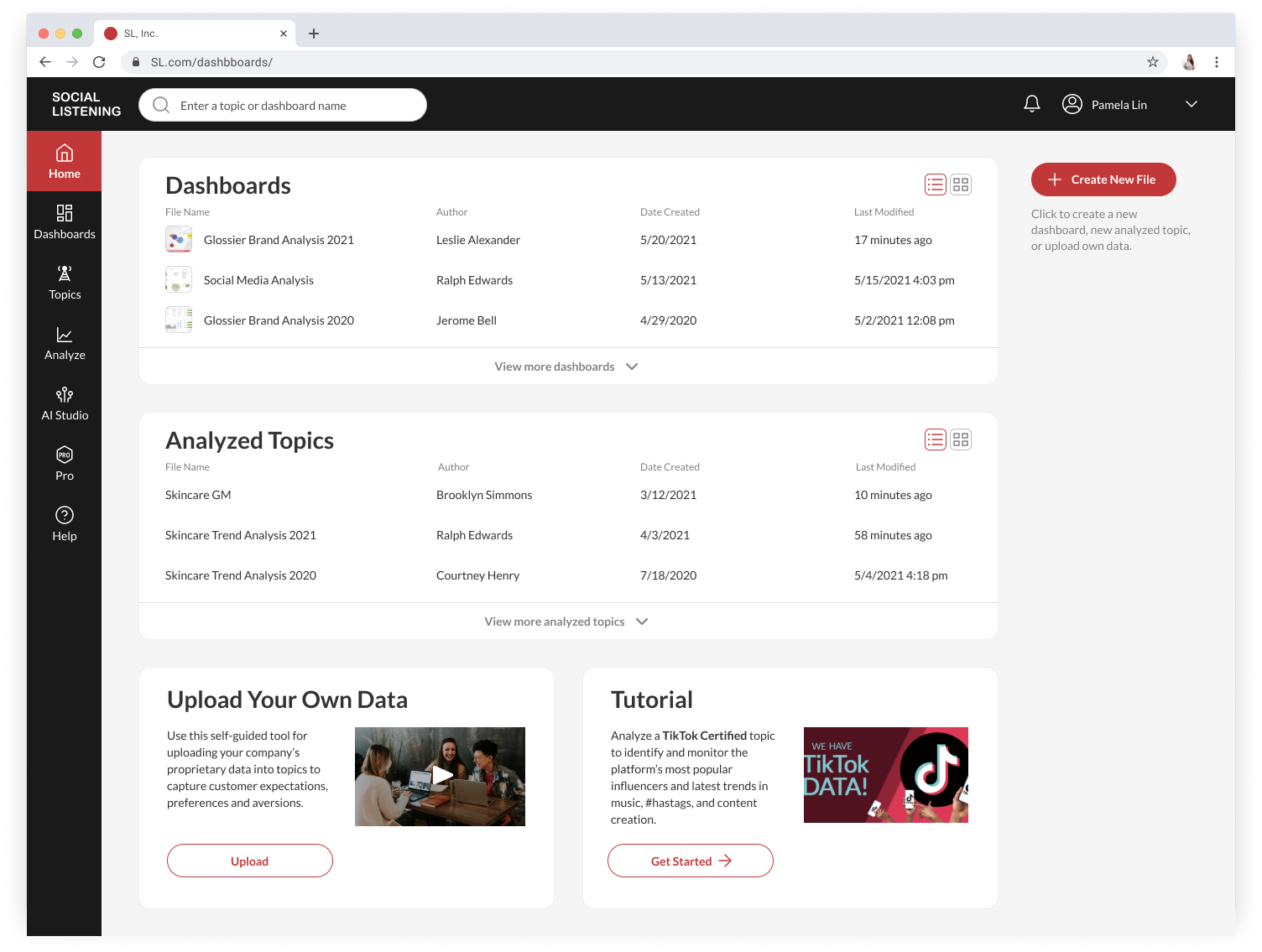
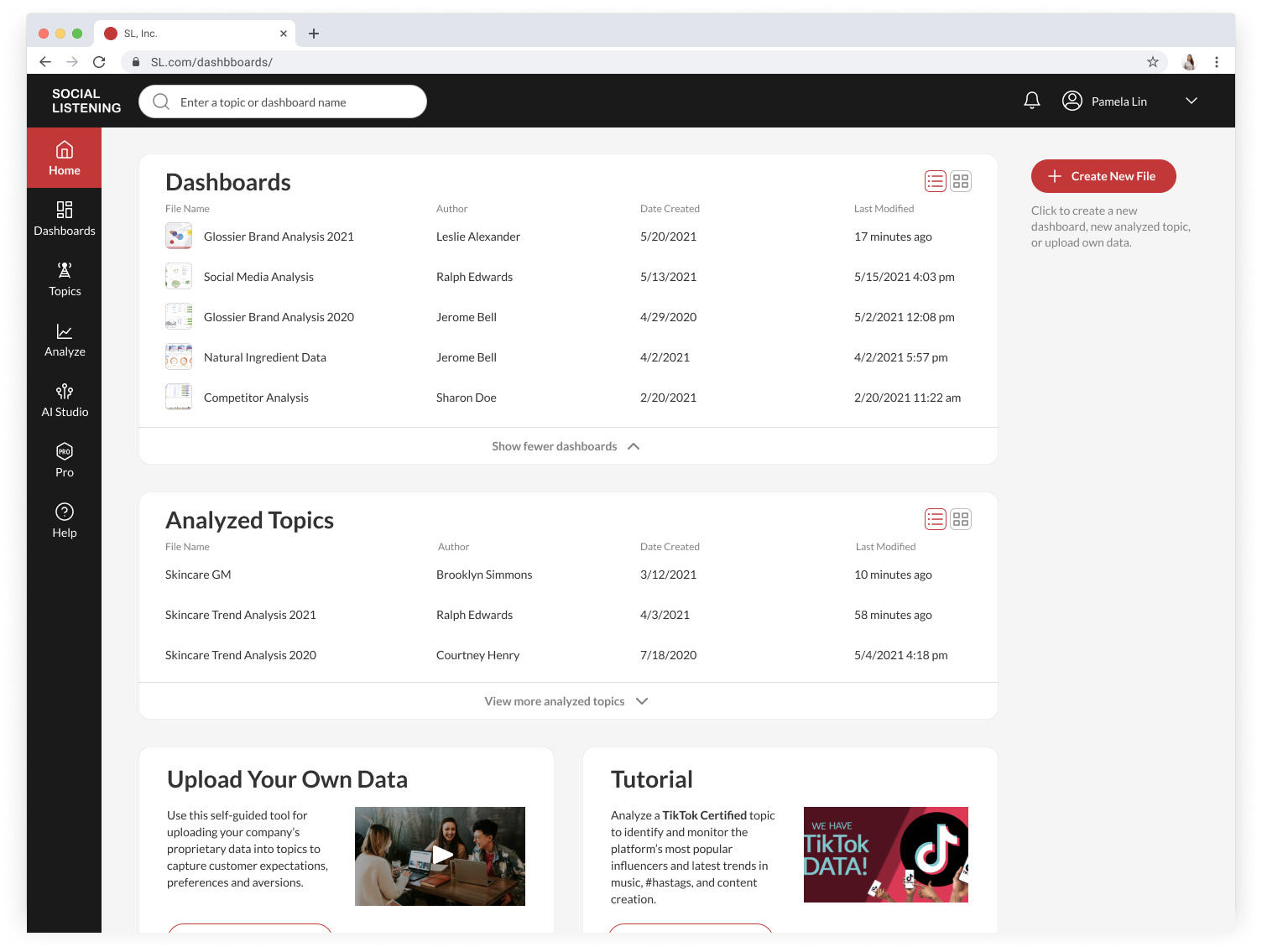
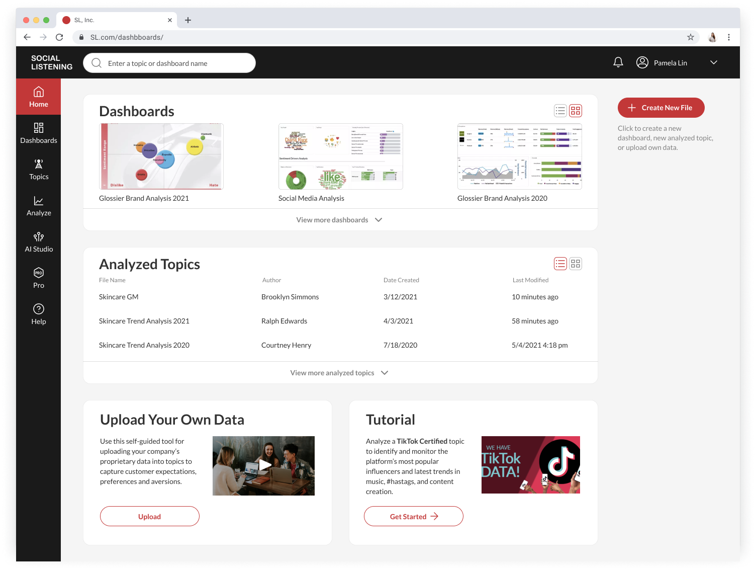
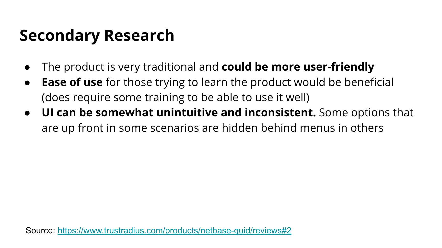
Usability Issues

Interface built by the engineers, not the product team
Inconsistent design system
Research


Design Exploration


If given more time…
Interview clients using the platform to really understand their needs of dashboard homepage
Play around with the demo to familiarize features
Why front-load upload data video and TikTok certified topic?
Are they important at all? If not, what should we highlight instead on Home?
Dig deeper into information architecture- Users mentioned some elements / features are hidden