

Tortuga
Improve navigation and UI for online e-commerce site.
Client
Tortuga, a wine, beer and spirit shop in Cayman Islands.
Team
4 key stakeholders
1 senior UX designer
1 visual designer
3 engineers
3 marketing managers
Goal
Uniform brand
Increase online orders
Increase total sales
Result
Increased sales by 74% within the first 3 months of release.
Locally well-known shop with outdated online presence
As a locally well-known and well-loved wine and spirits shop, Tortuga was struggling to establish an online presence and accommodate for various online shopping behaviors. They want not only the locals to know about them, but to also provide a great online shopping experience for tourists visiting Caymen Islands.

How might we present inventory in a way that is efficient and intuitive for users to make conscious purchasing decisions?
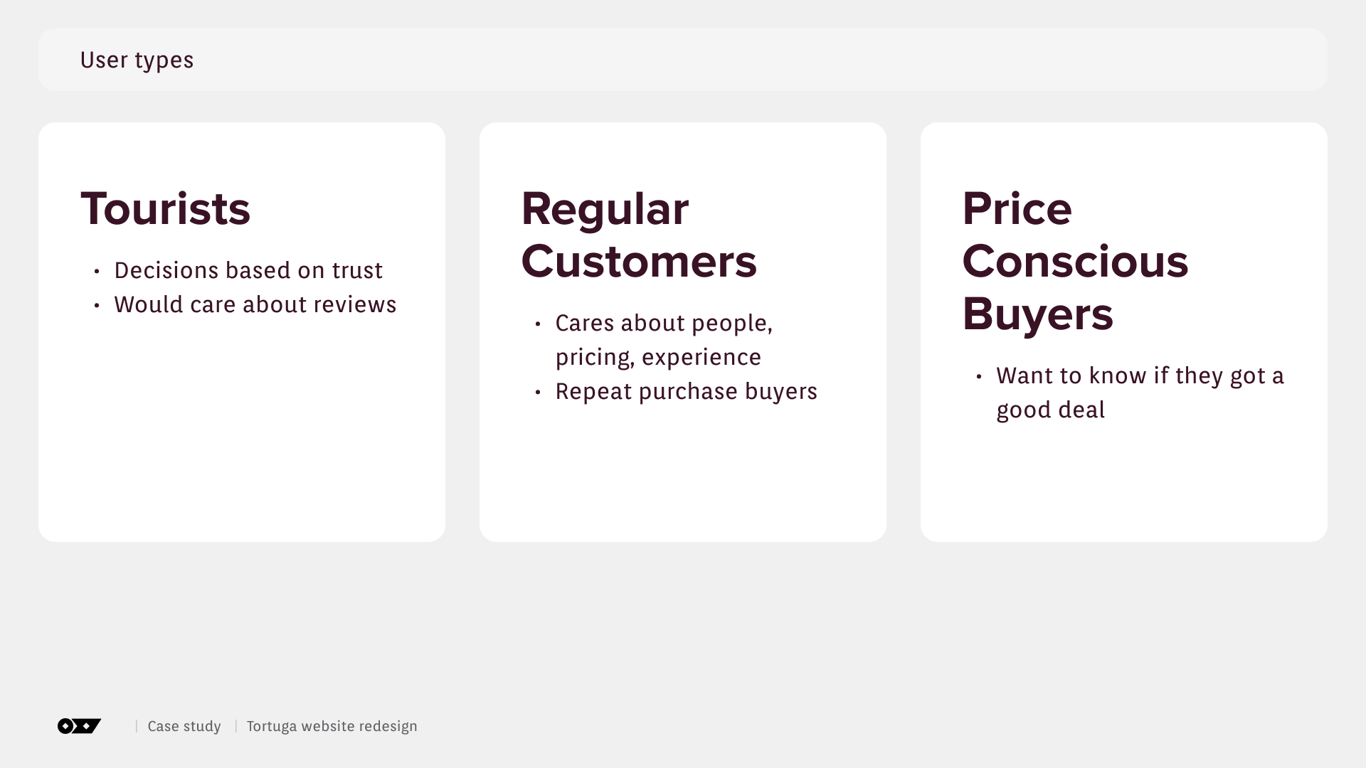
Understand user types and purchasing behaviors
To better understand user needs and their shopping behaviors, I initatied interviews with key stakeholders.

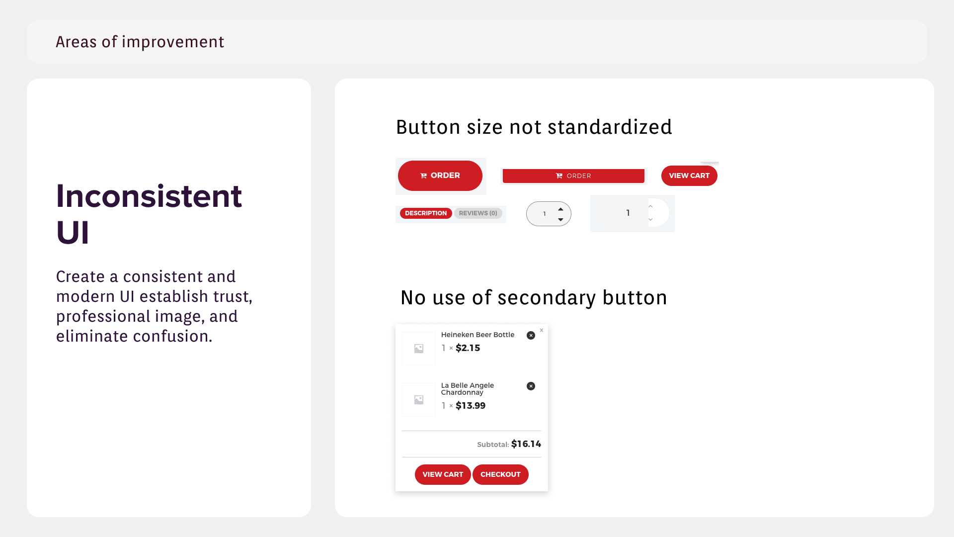
UX audit: Areas of improvements
I also conducted an extensive website audit to further discover other pain points. Some key findings were
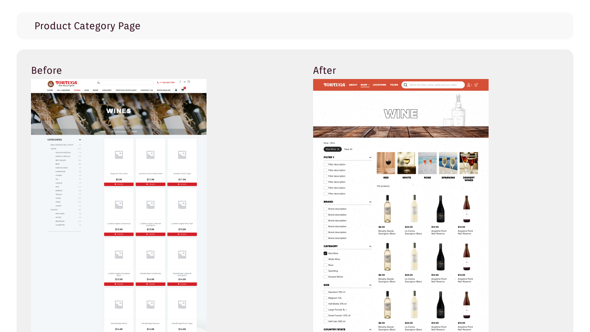
Information architecture is messy. The website structure is very flat, resulting in multiple tabs on home page and overwhelms users
Poor visual hierarchy on product description page (PDP). Too many font sizes and styles spreading across the page increase reading mental load
On their PDP, they are also missing very crucial product information which hinders users to make purchasing decisions
Overall, their UI is inconsistent. This not only increase processing time, it also harms the business to establish a trusting and professional image.


Restructuring the site


Final Design


If given more time…
Conduct user interviews to learn more about their behaviors
Run user testing to validate design decisions