OneNote Web Clipper
Save online content with a single click.
Duration
1-week design sprint
Team
Solo project
Responsibilities
User research, user flow, and UI redesign
OneNote is a Microsoft note taking app. In combination with OneNote Web Clipper, a chrome extension, users are allow to save online articles to their local OneNote app.
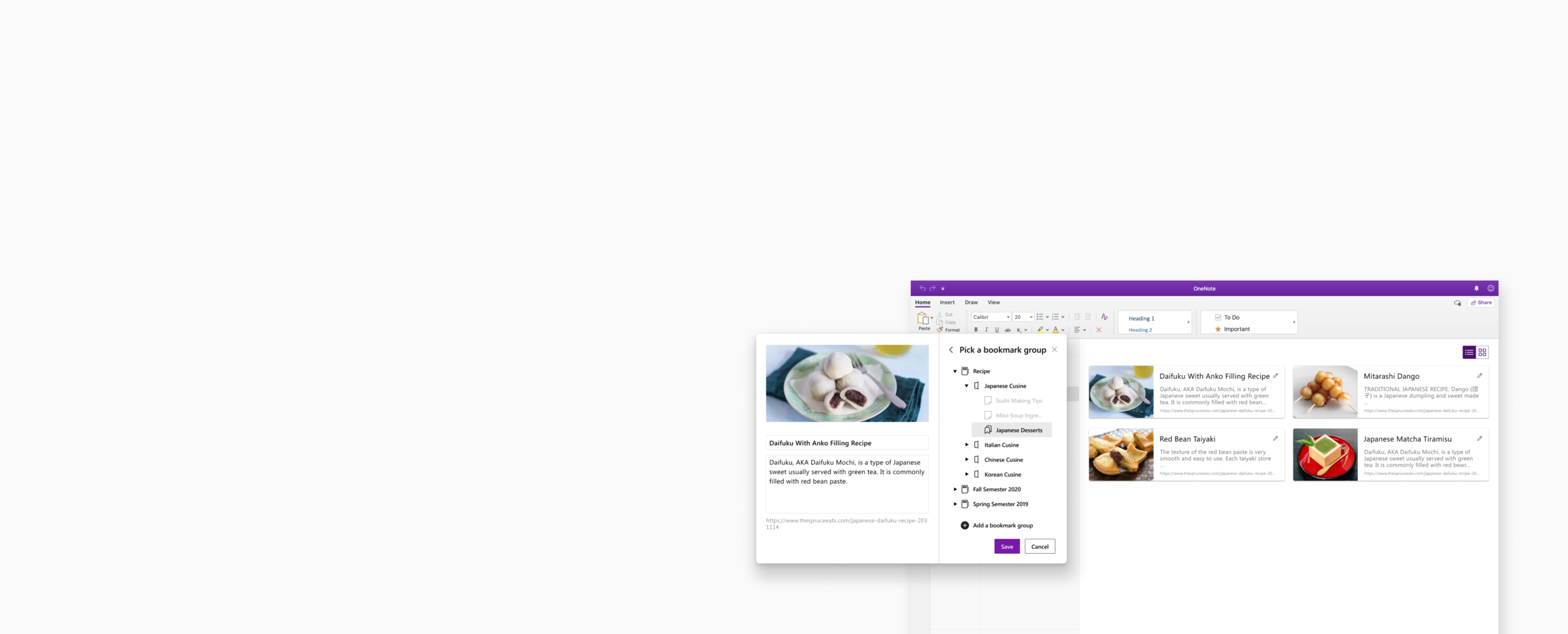
For this project, I wanted to focus on the bookmarking feature. I really enjoy using the extension, however, I find looking for previously saved bookmarks very troublesome due to the lack of organizational system. This prompted me to design a new bookmark feature to help users access content easily.
Goals:
Enhance bookmarking feature
Improve organizational system
Streamline bookmark saving process
Research
Who are the users?
To kickoff the project, I identified two personas by interviewing 3 OneNote users and 2 potential users. One persona is the OneNote Active User. Their goal is to find a way to quickly sort out bookmarks. Another one is the OneNote Novice User, who’s goal is to smoothly navigate through the extension.
User Pain Points
From secondary research and usability testing, I was able to identify 3 pain points.
Pain point 1: User have a hard time navigating chrome extension
Pain point 2: Users can’t save bookmarks into certain pages
…as a result, they end up having multiple pages of bookmarks. Yikes.
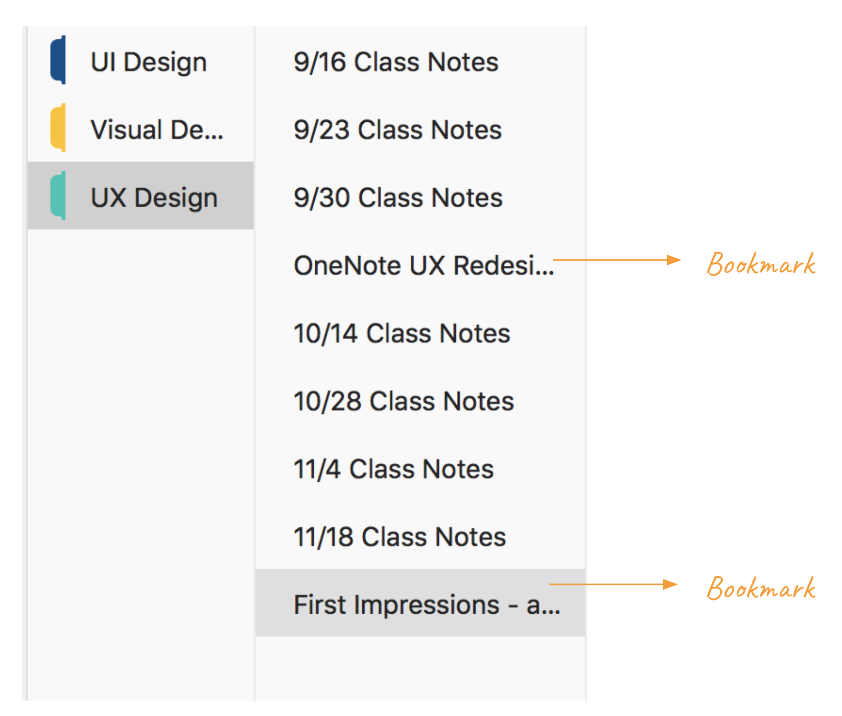
Pain point 3: Users have a hard time differentiating bookmarks and pages in OneNote
How might we…
How might we create a more intuitive process to save bookmarks?
So… how do we create a more intuitive process to save bookmarks? I started looking at other competitors interface design. Here’s what I found- Most of the bookmark extensions only have one panel to guide users through saving process. If there are more steps, it takes users through the saving location step by step.
How might we make bookmarks stand out from the page?
I also explored ways to make bookmarks stand out from the page. The inspiration I took were from are.na and Lasso which are two sites where you can collectively save online sites. During the usability test, a lot of users mentioned that they recall saved articles by images and key words. By categorizing saved links and displaying screenshots of the site helps users to revisit links easier.
Sketches and wireframes
With the information gathered from competitive analysis and usability testing, I did some quick sketches. I made sure to pay attention to how the information hierarchy is displayed on the extension panel. I also created wireframes to test out flows and information presented.
Final Design
Next Steps
Research how a chrome extension is built
Conduct usability testing
A/B test interface iterations
Fluent UI only
Fluent UI with some of my enhancement
Completely my design


